CREATIVE CLOSEUP: GIA BELLANTUONO
Welcome to Creative Closeup, an ongoing series where we spend time with inspiring women learning about their creative practice, the spaces they inhabit and how their work influences their style choices.
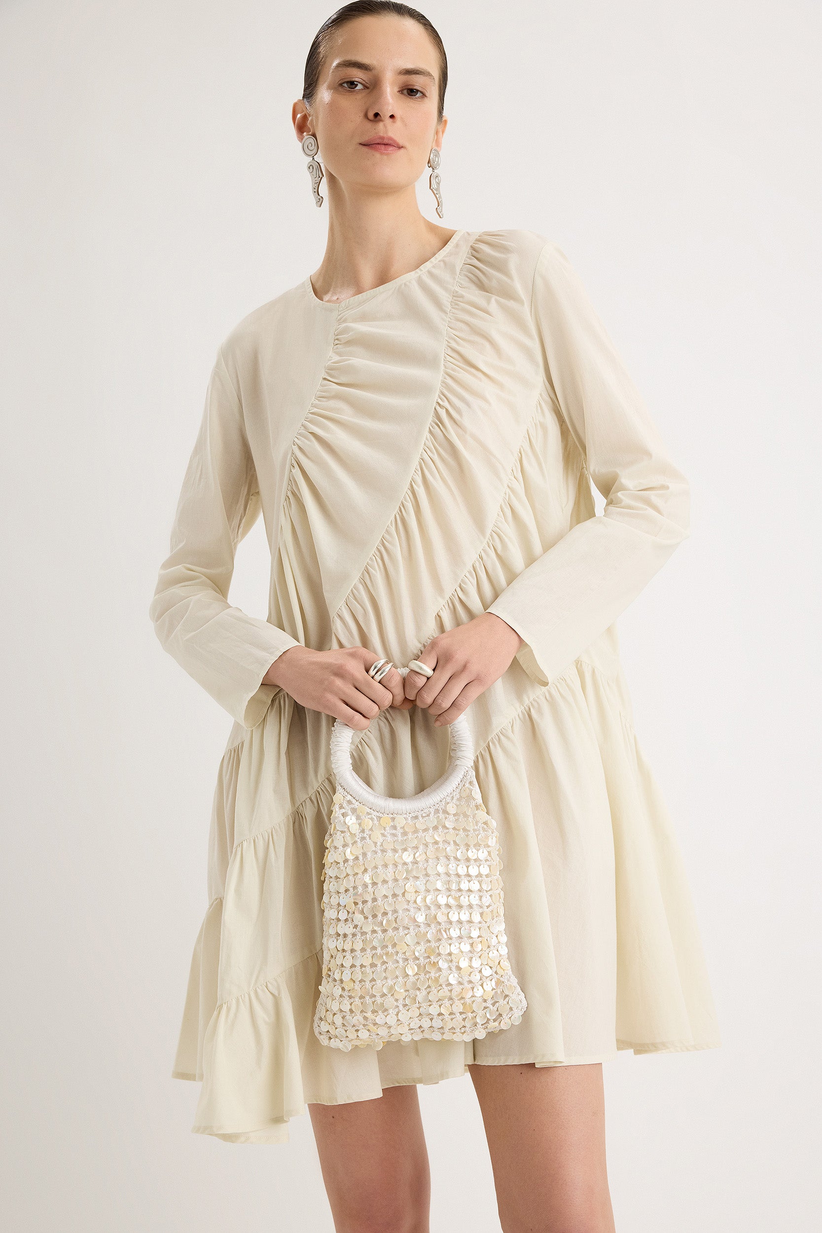
For our latest installment, we caught up with Gia Bellantuono, designer of Merlette’s evocative prints for Pre-Fall 2024. What interests the New York City-based multidisciplinary artist is the tension and interplay between colors, as seen so beautifully in the impressionistic Dansa Floral Print she custom created for the season. Here, she walks us through her creation process and the diverse sources of inspiration for her art.

Q: When color consulting for Merlette, can you tell us more about your process and why you chose the colors in these prints?
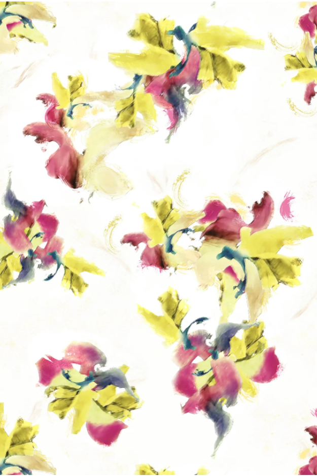
A: We drew inspiration for both color and print from Alice Guy-Blaché's “Dansa Serpentina,” dating back to the late 1800s / early 1900s and famously captured on film by some of the earliest filmmakers from the dawn of cinema. This dance offers a rich palette to explore. I am very sensitive to color and let my intuition guide my path. It's thrilling to be drawn to colors organically and watch everything fall into place. For example, the colors we used, called Cinder and Flame, create a color dissonance that adds dynamic energy to the story.
Q: The color palette for each print is so unique. How did the color drive the pattern? How would you describe the pairings?
A: Color to me is the most conceptual of practices. The composition of color is like an ecosystem. All of the colors must work with each other in harmony to enhance and enliven. But there also must be opposition. I’m drawn to that thing that is off—both in color & composition—that gives us a certain feeling. This is the most human part of making: where inner knowing and instinct come into play.

Q: How do you work with the designer's own inspirations to come up with your concepts?
A: Collaboration with designers and brands is such a joy. I’m so fascinated to see what inspires others. It often creates a ricochet of other ideas and generates a lot of momentum for the collection. My influences are diverse, drawn from personal experiences and visual encounters. I am most inspired by art & objects that I see, collect, or make. Even by daily rituals, like the things that I cook & their vibrancy of color. Or the fresh flowers I keep in my home. I also take a lot of film & digital photographs—often of trash! I’ve been doing it for years and they are always my favorite color compositions.

Q: How did you create the patterns? Are they painted or sketched? What materials did you use?
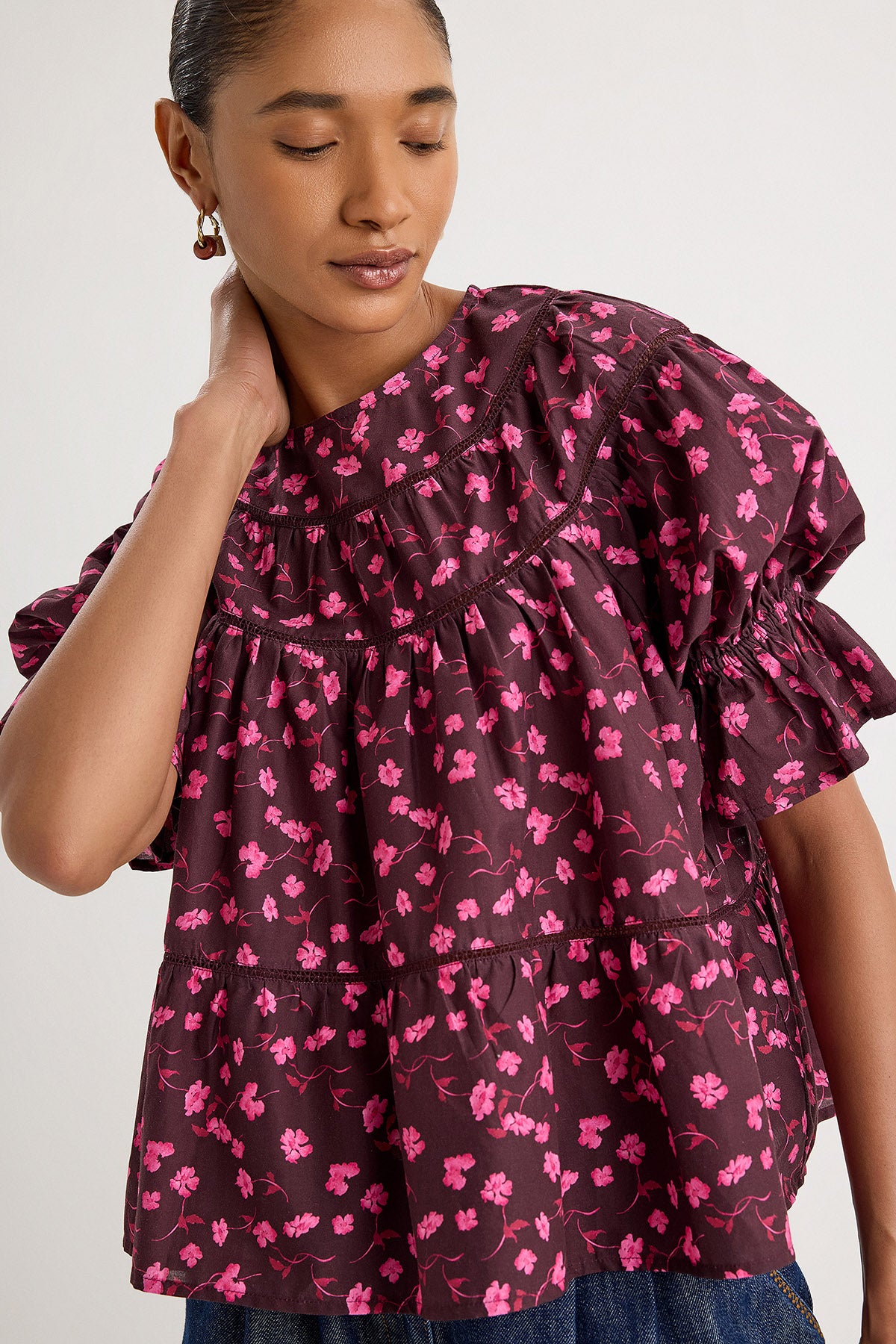
A: The “Dansa Serpentina” directly inspired the Dansa Floral Print and the way the colors move into one another. This concept was first hand painted with a mix of inks, watercolors, and gouaches to capture the movement and shapes of the dance. Then they were collaged to create the motifs of the print. I love that this print offers the suggestion of a floral in soft, wave-like forms.

As an artist it is exhilarating to have such an innate grasp of a modality like painting; I’m free to articulate in any style. For the Painted Ombre Floral Print, I was inspired by the artwork of Alex Katz and aimed to infuse it with the interplay of sharp, flat shapes and a staccato rhythm. The petal motifs dance across the surface, connecting us back to the “Dansa Serpentina” concept.